AgileThought · Client: New Horizons · Education · 5-month engagement
The conversion drop was an information architecture bug.
How does a platform “upgrade” erase a third of your sales?
Cart conversions fell 32% after a platform “enhancement,” and telemetry blamed search. I audited the IA against L.A.T.C.H. and found the real defect: price, location, format, and schedule (the four things career-changers buy on) were buried or missing. I rebuilt discovery around them.
01 · The problem
Telemetry blamed Search. Telemetry was wrong.
Cart conversions dropped 32% after a round of platform enhancements. Telemetry pointed at Search; my brief was to find what broke.
The short version
- I found two of the five ways to organize information in use. The missing three were what buyers shop by.
- No research budget, so I built the personas and recruited the testers myself.
- All 15 participants validated the filter-first redesign. Surfacing price was the biggest single fix.
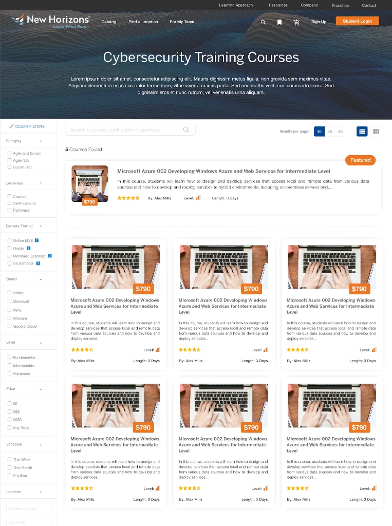
The redesigned catalog. Category, credential, delivery format, brand, level, price, schedule and location surfaced as first-class filters, which is the four missing dimensions from the audit put back where a buyer looks first.
02 · The diagnosis
Two of five
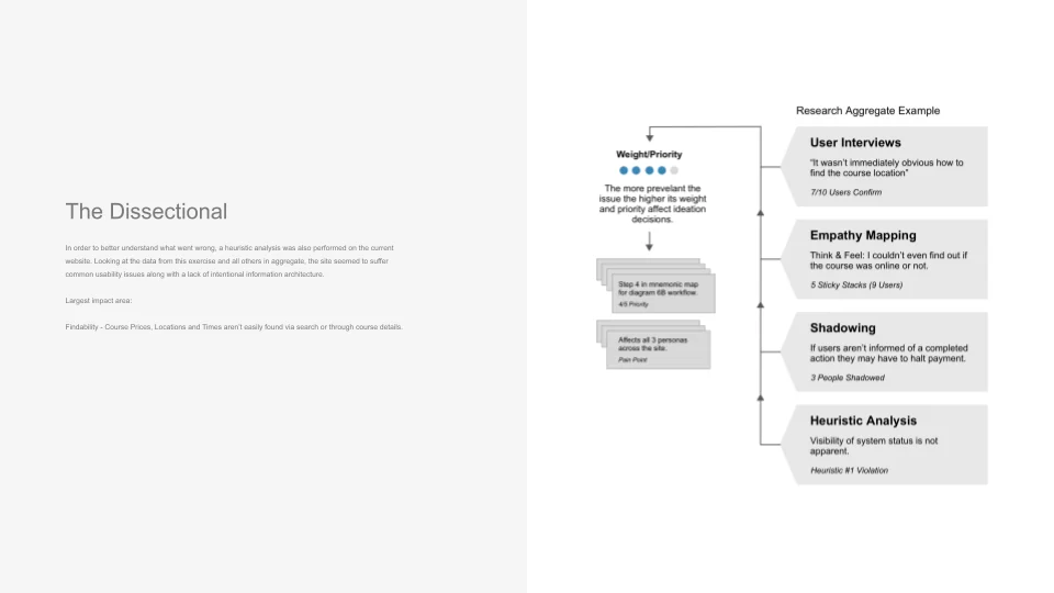
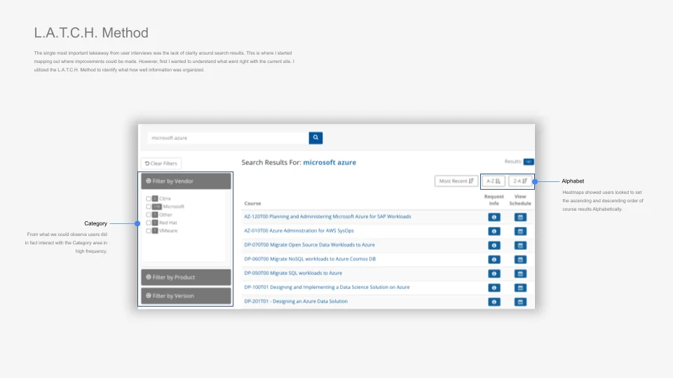
Rather than take the telemetry at its word, I put together a research aggregate: a heuristic audit, interviews, empathy mapping, shadowing, and then checked the site against L.A.T.C.H.: Location, Alphabet, Time, Category, Hierarchy. It had Category and Alphabet. You couldn't browse by where a course ran, when it ran, or how it laddered up to a credential, and those three things are almost the entire basis on which a career-changer decides.
03 · Who I built
Three personas, no budget
04 · Empathy
Inside the veteran's decision
05 · The audit
I scored the site against all five
06 · The audit
Diagnosing a broken IA
The Dissectional
A heuristic analysis of the current site was performed alongside user interviews, empathy mapping, and shadowing. Findings were aggregated and weighted by prevalence to prioritize ideation decisions.
L.A.T.C.H. Method
Applied the L.A.T.C.H. framework to audit the existing site's information architecture. Category and Alphabet were the two organizing principles users already engaged with. Location, Time, and Hierarchy were absent.
There was no budget for a formal study, so I ran KLM-GOMS against the recorded sessions we already had. Rigor turned out to be a resourcefulness problem more than a budget one.
07 · Resourcefulness
Research on a $0 budget
The client wouldn't fund personas or testers. So I built three personas out of the data that already existed (Military Veteran at 72% of users, Postgraduate, Middle-Aged Adult), recruited community members to sit with, and ran five participants per persona through iterative prototypes. The budget shaped the method, and I made sure it didn't shape the rigor.
08 · The solution
Surfacing what career-changers buy on
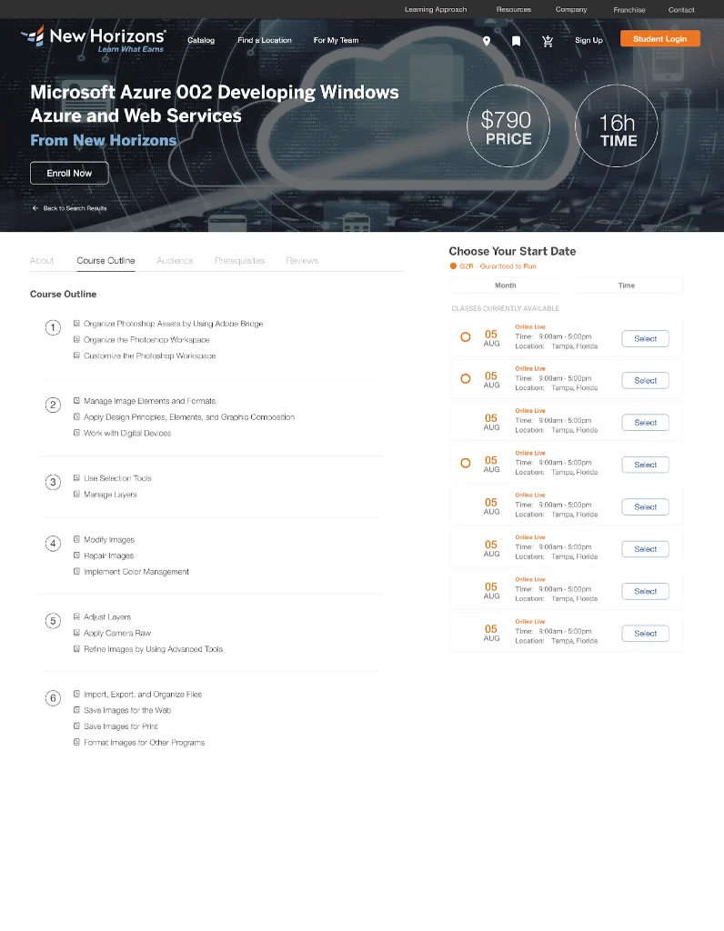
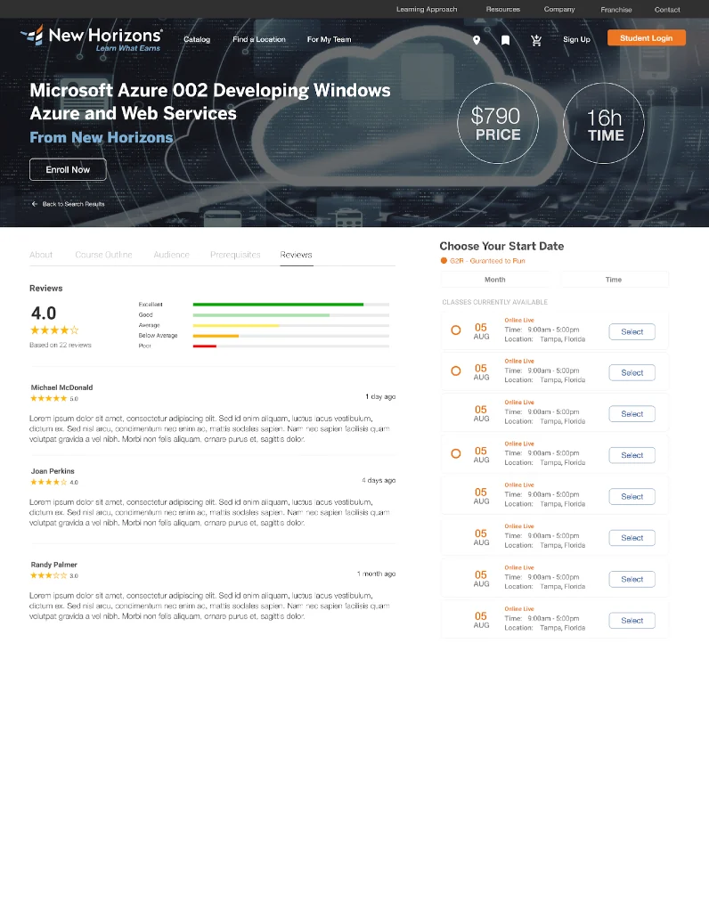
The three pages that carry the fix, left to right: catalog and search with price, location, format and schedule as filters; the course detail with its outline and an inline schedule selector showing live class availability; and the reviews tab with the aggregate rating breakdown next to the same selector.
Curriculum and live schedule on one page. Ratings sit next to the enroll button, which is where somebody wants the proof.
09 · Reflections
Results & takeaways
- One root cause: price, location, format, and schedule were buried or missing. Surfacing them was the fix.
- The L.A.T.C.H. audit let me explain the gap in one slide: two of five principles present.
- I built the personas and recruited the testers with no budget at all. The constraint shaped the method. It didn't get to shape the rigor.
- All 15 participants validated the filter-first direction.