AgileThought · Client: Microsoft Store · Retail operations · 2012
A nervous system for a young retail chain.
In 2012 Microsoft Store was still a young chain finding its retail footing, and store employees needed one place for everything head office and the floor exchange: promotions, training, the weekly focus, store photos and the people being recognized. I designed the employee portal that carried it, in the flat, typographic design language Microsoft was rolling out across everything at the time.
The short version
- A store employee's questions are concrete: what are we pushing this week, what changed, who do I ask. The portal answers those on the home page.
- Recognition (MVPs, birthdays, callouts) sits beside operations on purpose. Retail runs on morale as much as memos.
- The Metro-era design language did the branding work: big type, flat color, photography of actual store teams.
01 · The product
What the floor needs from headquarters, weekly
The portal's spine is the weekly cadence. A focus message from leadership, the current promotions with talking points, what's new, and the training that goes with it. Around that spine: community forums, an ideas channel so the floor could talk back, store photos and video, and the people module (store leader, monthly MVP, birthdays) that made a national chain feel like a staffed building.
Designing in the Metro language before most of the world had seen it was the fun part. Big type and flat color look easy until they have to carry a promotions module, a media player and a calendar without a single box or bevel to lean on.
02 · What shipped
The home page, week of August 30
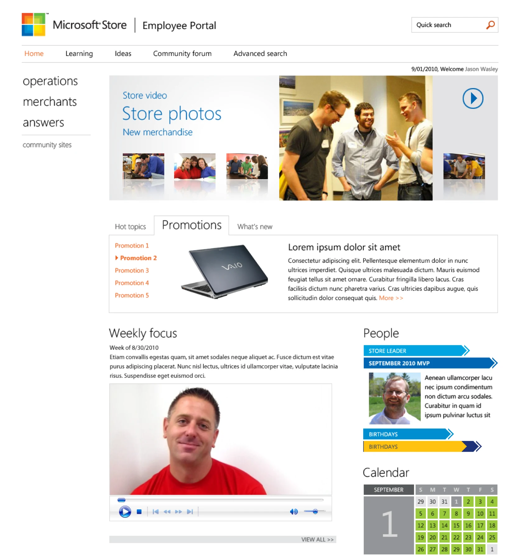
One screen carrying the week: promotions with their talking points, the weekly focus video, recognition and the calendar. The design language is 2012 Microsoft to the bone, which was precisely the assignment.