AgileThought · Client: Discovery Cove (SeaWorld Parks) · Travel · 2018
The site was beautiful. The bookings said otherwise.
Discovery Cove is SeaWorld's all-inclusive day resort in Orlando: capacity-limited, reservation-only, and expensive enough that nobody books it on impulse. The site looked the part and converted badly, especially on phones. I led a full responsive redesign built around intentional user journeys, from first look to a configured, dated, paid reservation.
The short version
- High-consideration purchases fail in the gap between inspiration and configuration. The old site made you start over at that gap.
- We mapped the journeys people were actually on (dreaming, comparing, committing) and gave each one a path.
- The package builder became one continuous flow: pick the packages, see the calendar, keep your context.
01 · The problem
A brochure where a booking engine needed to be
A day at Discovery Cove costs what a night at a resort costs, and it sells out by design: attendance is capped, the dolphin swim is scheduled, and everything is a package with dates attached. That's a considered purchase, which means people arrive many times before they buy. The old site treated every visit like the first one. Inspiration lived in one place, prices in another, and the reservation flow forgot everything you'd looked at.
Conversion was the stated problem, so we treated conversion as the design brief rather than a metric to watch afterward. We worked with their team on explicit conversion goals per journey, then designed the shortest honest path to each.
02 · What shipped
One flow from package to date to paid
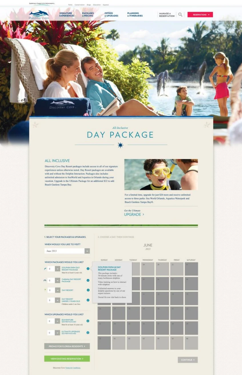

The package configurator carries the whole decision on one page: which packages, which upgrades, which day. The calendar answers availability before checkout instead of during it. On the right, the same system on a phone, which is where most of the traffic was.
03 · What I keep
Intentional journeys beat prettier pages
The redesign's real work was structural: naming the journeys, agreeing on what each one had to accomplish, and cutting everything that didn't serve one. The visual refresh mattered less than the fact that a person comparing packages on a Tuesday lunch break could pick up on Saturday where they left off.